Another season, another reason, for making a little GIS. Just finished this year’s edition of the GIS course, and thought of starting a little tradition¹: posting some procedure that we have done in the classroom, with free software and public data. Teaching conditions keep deteriorating via sustained budget bottlenecks, so let this be also my way of overcoming sadness and discomfort.
We used QGIS, SeaDAS and data from NASA’s Ocean Color server to do what the title of the post says. Here I will repeat the procedure with a slightly different dataset, because these days one reads a lot of info about a large El Niño building up.
Now, El Niño and its counterpart La Niña are massive changes in distribution of seawater temperature of the equatorial and tropical Pacific Ocean. During strong El Niño events, the eastern equatorial Pacific accumulates a lot of warmer water, to the point of suppressing the upwelling of cooler, nutrient-rich waters, and hitting hard the ecosystem that relies on them.
One reads that the best way to follow them is actually by looking at sea height anomalies. However, the latter are more complicated to find and download for a simple procedure like this one. So we stick to SST (surface seawater T) as rendered by MODIS Aqua. It goes something like this²:
- Get and install the software; simple downloads and setups should do.
- Go to Ocean Color web page and click on Data Access to see what they offer.
- No, it won’t kill you browsing around that beautiful webpage and reading some info before downloading stuff like a hacker in a cheesy TV show.
- We’ll use the easier, spatially and temporally merged Level 3 Browser, and look for Aqua MODIS SST (11 µm, nightime). There are several, intuitive drop-down lists, where we select data averaged for a whole month, and the coarser spatial resolution (9 km).
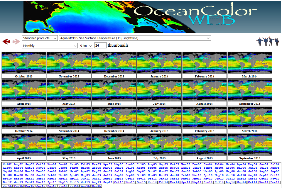
- Clicking the center of thumbnails displays a large picture, which helps selecting one dataset or the other. We want to download the data for September 2015; clicking on the lower left corner of the corresponding thumbnail (‘SMI mapped’) does precisely that, and we’d get a NetCDF-4 file. It’d be named ‘A20152442015273.L3m_MO_NSST_sst_9km’, a cumbersome but informative naming scheme telling us the sensor, the initial and final ordinal dates averaged in the image, processing level, parameter, and spatial resolution.
- Opening the file in SeaDAS allows browsing the global metadata (‘Metadata > Global_Attributes’): there’s info on the type of data, including provider, spatial extent, and data range.
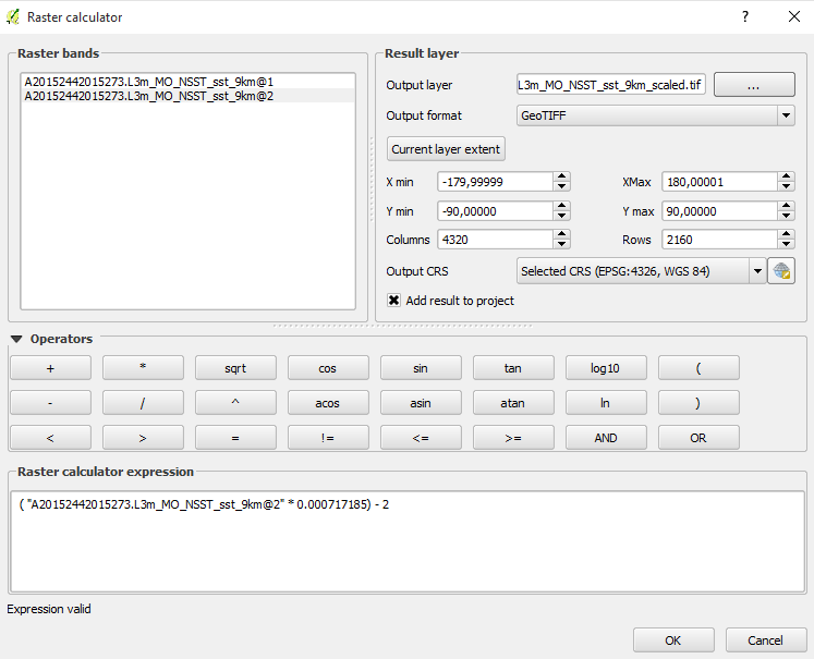
- The file contains more specific metadata: ‘Band_Attributes’ shows scaling information as ‘scale_factor’ and ‘add_offset’. We will need that info to scale the data to a SST raster layer.
- A double click on ‘sst’ under ‘Bands (products)’ shall display a colorful rendition of SST à la SeaDAS (it uses color scheme ‘SST’ stored in ‘Tools > Color Manager’). With ‘Info > Pixel Info’ we’d see information on location and SST under the pointer of the mouse.
- To use the data easily, export to GeoTiff with ‘File > Raster Export’. The exporting dialogue allows selecting a subset of the bands, which would make sense particularly in the case of complex L2 Level files. L3 SST includes only two bands: the data per se and quality flags.
- Once in QGIS, setting the project’s coordinate reference system to WGS 84 (EPSG: 4326) is a good idea; L3 data come in an Equidistant Cylindrical projection (which informs correctly on distances, but not so much on areas).
- Opening the above geotiff file of September 2015 SST would likely display a familiar flat view of the Earth, in whatever colormap your QGIS decided to paint it. But let’s set aside colors for a while. QGIS comes with a ‘querying’ tool that works fine for vectors; for rasters, it is better using the ‘Value Tool’ plugin. It displays the values under the mouse pointer for any active raster layer. This is how mine looked just in front of my hometown:

- SST should be in the 2nd band; the first contains info on the quality of pixels. Not even global warming could yield that SST: the layer is not scaled. We need to use raster algebra – nice lingo eh – to transform those values into degrees C. We use ‘Raster > Raster Calculator’ and the info contained in the band’s metadata, ‘scale_factor’ and ‘add_offset’, to do the trick. Mine looks like this (remember to scale band 2, not 1):
- Running the calculator should make in no time a new raster layer with SST in degrees C. ‘Value Tool’ again could tell us whether it looks like SST. See mine below, although looks depend on the chosen palette or colormap; such color schemes can be used to highlight the features of interest.
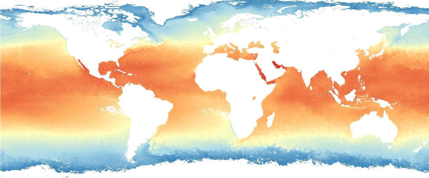
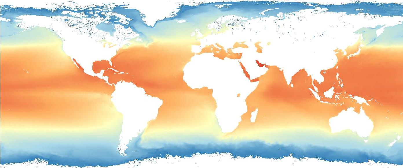
- No surprise intended, tropical and equatorial waters are warmer. But we were interested on where they stand against reference conditions. Let’s go back to the L3 browser at Ocean Color, and in this case we pick the option ‘Monthly climatology’, which give us average September conditions from 2002 to 2015 (how about that?!). Make sure the sensor, parameter and spatial resolution are the same as for September 2015, and download the SMI mapped file. Its name would be A20022442015273.L3m_MC_NSST_sst_9km.nc (first day of September 2002 to last day of September 2015).
- Repeat the above procedure in SeaDAS & QGIS to get an scaled geotiff layer, displaying correct SST values. Plotting it with the same colormap as above (which can be saved and reused in other layer) would give a similar picture, although some differences start to show (beyond the naturally smoother look of the long-time average):
- But we are looking for anomalies, and intend to highlight them. So if the question is how different last month’s SST was from reference conditions, why not just operating with the layers to show just that? ‘Raster Calculator’ and a simple difference September 2015 – September 2002 to 2015 would do the trick. See it below, colored to show anomalies from – 4 (blue) to +4 ºC (red):

- Warmer waters are indeed evident off the Pacific shores of equatorial South America. Now let’s tweak the view a little bit using also public domain maps available at Natural Earth. That site allows downloading and reusing a lot of vector and raster layers at different spatial scales. But there is also a QGIS plugin that comes handy now, ‘Natural Earth Raster’. It eases download and direct use of several layers as basemaps.
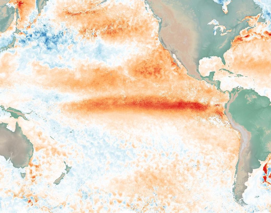
- The view above uses a WGS 84 / Pseudo-Mercator projection centered at 150W. Note also, at the top- and bottom-right corners, how anomalies give away the Gulf Stream and the Brazil Current. And finally, ‘Print composer’ tool in QGIS allows preparing and exporting high-res images of any work.
Will this Niño finally be huge, or will it fade away? I guess we’ll see, won’t we?
¹ You know, things done without any particular reason.
² Intended to work smooth in an introductory GIS course, while training several tools; there could be of course faster / better alternatives.
